Photography studios are notable for their aesthetic and commitment to making art the room’s focus. For these reasons, the decor and colors of studios are usually simple, solid, and neutral. The best colors for photography studio walls are as follows.
Here are the 7 best paint colors for photography studio walls:
- Black
- White
- Gray
- Green
- Pale Blue
- Cream
- Whatever color fits your style
In this article, we’ll examine the feelings and elements that each color brings forward and why those elements are essential in designing photography studios.

- 1. Black
- Black Helps To Control Lighting and Provide Contrast
- Use a Matte Black for More Texture and Less Gloss
- 2. White
- White Helps To Bounce Light and Eliminate Shadows
- White Is Great for Food Photography
- 3. Gray
- Light Gray Vs. Dark Gray
- 4. Green
- Create a Green Screen Effect
- Green Has a Calm and Natural Vibe
- 5. Pale Blue
- Pale Blue Makes for Cool Tones
- 6. Cream
- 7. Whatever Color Fits Your Style
- Sources
1. Black
While a popular “color” in the art world, black is considered the absence of color and light, making it not a color. Technically, black is considered a shade. Nonetheless, it’s a popular choice for photography studio walls.
Black can be created in art by mixing many dark colors together. (And for the sake of this article, we’ll consider black as a color since it’s available to buy in a paint can.)
Black Helps To Control Lighting and Provide Contrast
Since black is so dark, it rejects nearly all light bouncing off of it. This is beneficial in the world of photography because it lets you better control the lighting of a room. Additionally, it doesn’t cast a glare on photos since the light is coming from controlled sources rather than bouncing from walls or other places.
If your photography is more on the darker side, showcasing moodier pictures, landscapes, or people, the black will help add to this effect. In addition, this vibe of art creates an overall dark and moody aesthetic in the room.
Black will also provide a good contrast, so the focus in the room is entirely on the photos; There’ll be less to focus on outside of the photographs as opposed to a room with bright purple or blue walls.
When using black walls, it’s important to note that you’ll have to account for extra lighting when taking photographs. It may be helpful to take test shots with various artificial lighting sources until you find the combination that works best for you and your studio space.
Use a Matte Black for More Texture and Less Gloss
Many photographers like to use a matte black paint. They may paint the inside border of their lense with this paint to get the desired look of their photos. Painting the camera interior with matte black paint can change the whole outcome of the pictures. You can also use a matte black paint for your photography studio if you prefer.
Matte black is a more textured and less glossy black. It can have the same richness in saturation but still gives an overall different look to the room due to its texture. Matte black can appear edgy and gothic when used for designing purposes.
If black or matte black walls seem intimidating for you as a photographer, you can choose to paint just the ceiling of the studio black! A black ceiling will also offer the benefits of light not reflecting off of it. It absorbs the light that hits it, which will help with glares and shadows in your photography.
Overall, the color of your photography studio will depend on your preference and your personal style of photography. For more vintage, moody, or sultry art, black is an excellent color option for photography studio walls.
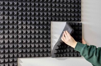
Check out my article on affordable studio flooring options![]()
![]()
2. White
White, the opposite of black, is another very popular choice for photography studio walls. While opposites, like black, white is technically a shade rather than a color. Also, like black, white can be used to portray moods and feelings, which is helpful in the world of art, especially in a photography studio.
In general, for a light and airy aesthetic in your photos, white walls are the way to go. They’re also beneficial for lighting and aesthetic purposes.
White Helps To Bounce Light and Eliminate Shadows
White is probably the most common color to find on photography studio walls. It allows light to bounce better, which is great for photos that need to emphasize the hue and saturation of the subjects.
Photography studios also opt for white because it helps eliminate shadows in the photos. If your lighting isn’t as bright as anticipated, white walls can help create the illusion of brightness. Additionally, white is easier to clean than black walls.
For displayed photography, like black, white helps to keep the focus on the art. It’s clean and doesn’t draw the eye so that observers will be more focused on the art in front of them. Plus, it creates a clean and straightforward aesthetic in a room.
White Is Great for Food Photography
White is the best option for photographing objects like food as a background. It helps showcase the saturation of the food or other objects. If you watch commercials for restaurants or fast-food establishments, you’ll notice the food is frequently shot with a white background.
White backgrounds and walls can even be used for photographing white objects such as eggs. While it was once tricky to master capturing white on white on camera, photographers have learned that it can be quite a beautiful look.
3. Gray
Gray is a neutral color that falls between the spectrum of white and black. As a neutral, it offers many of the same benefits as black and white, especially when it comes to interior decor and wall colors.
Gray is a color without color and is a mixture of both black and white, which we learned previously aren’t colors at all. Typically used in interior and exterior design, fashion, and more, gray is a color that goes with everything, blends in well, and promotes emotional reactions from its use.
Gray can be seen as a moody color like black, similar to how you’d feel on a gray and cloudy fall day. It can also be seen as airy and light depending on the shade, similar to white.
In a photography studio, gray is an excellent color to use. Cameras see everything in shades of gray. When doing photography, your camera will average everything in the frame to a middle-gray look. This is why gray walls work so well in a photography studio– it’s only natural to pair gray with professional photography.
Light Gray Vs. Dark Gray
Many professionals would recommend a lighter shade of gray for specific desired effects. Light gray can help you gain lighting in a room but may have less light bouncing than white walls will. A light gray will also help soften your photos.
Dark gray, on the other hand, can be a preference of many to receive similar benefits to black walls. There’s less light bouncing off, creating a contrast between the photo subjects and the background.
Gray is typically measured on a scale determining its percentage of black. The darker the shade of gray, the more black it contains, and then further to the right on the scale it is. In contrast, the less black it has, the closer it is to white on the scale.
4. Green
When used correctly, green can be a fantastic color for a photography studio. It’ll help you and your work really stand out.
Create a Green Screen Effect
If you know what a green screen is, then you can understand why green may be a good choice for photography studio walls. Particularly if the photographer specializes in special effects or changing the backgrounds of photos.
These days, when photo companies go to schools to take individual student pictures, parents have the option to pick what background they want. Usually, this consists of neutral options like trees or generic landscapes. This is because the photos are taken in front of a green screen, so the background can be easily switched out.
Painting your photography studio walls would result in a similar effect. It would allow you to be able to have creative control over the background of your subjects and even have some fun along the way.
The green used for green screens is a very particular and rich shade of green. If this color can be replicated in paint, it’ll be useful to have on studio walls. In addition, having green studio walls is most beneficial for special effects photographers. For general photography, it may be better to stick to one of the neutral shades we discussed earlier.

Green Has a Calm and Natural Vibe
Green used for aesthetic purposes rather than photography purposes can be a bit harder to master. As a photographer, you probably have an eye for aesthetics and want your studio to reflect that.
If you opt for green walls, you want to make sure any decorations you have match the vibe well. Green is often associated with calming nature and healing, making it a unique option for wall paint. To pair with green paint, you should have the neutral decor in colors like black, cream, gold, etc.
Here’s my review article on premier pro for beginners![]()
![]()
5. Pale Blue
Pale blue, so pale it’s almost white, is a creative choice for photography studio walls and offers many benefits to the art itself.
Pale blue is similar to white in the benefits it offers. Its light pigment helps eliminate shadows and contrast. It also provides a light, airy feel in its photos.
Pale Blue Makes for Cool Tones
The biggest difference between pale blue and other colors for walls in a photography studio is that pale blue will change the temperature of the photos. Pale blue will make a colder temperature, which many photographers prefer in their photos.
Temperature is determined by the tones of a photo. Cool tones result in a cooler temperature, while warm tones result in a warmer temperature. In this case, pale blue walls will provide a cooler result.
If you’re not a fan of warm tones, pale blue or white with tinted blue is a smart option for your photography studio.
6. Cream
Similar to pale blue, cream walls offer many of the same benefits as white walls, including brighter scenery and less shadow and contrast. In contrast to pale blue, cream walls will offer a warmer tone and temperature rather than a cooler one.
Cream walls can set up a light mood as well, with a warm and cozy feel. Many photographers like cream walls for family portraits as it gives off a cozy feel. Cream can soften up the look of photos. By softening the photos, they may look less staged or sharp, which is a preferred look for many photographers.
Cream also requires less additional lighting than colors like black or gray. Cream walls will allow you to better control the lighting for your photography.
In addition, cream can be aesthetically pleasing to the eye. It’s easy to pair with neutrals to create a consistent theme in the studio.
Cream paint, or an off-white shade like eggshell can be an excellent choice for your photography studio and provide a warm and comfy atmosphere for both you and your photography subjects.
7. Whatever Color Fits Your Style
Like all art, photography is subjective. This is a good thing, as it means you don’t have to follow a specific rulebook to pick the wall color and overall design of your photography studio.
Every photographer has their own personal style and spin on their art. Neutral colors like white. Gray, and black may work for many, but other artists may prefer a bright blue or pink wall simply because that’s what suits them.
Art is a creative field, and there’s no limit to the creativity you can explore. This article examined common wall colors for photography studios based on qualitative terms like lighting, contrast, shadows, and more. However, if those factors aren’t related to your style of art, you don’t need to follow them.
If you’re opening a photography studio and want rainbow walls with glitter or a landscape of a forest painted around you, no one is stopping you, because having no limits is what makes photography so great!
Check out my other article on floating floors and if they are good.![]()
![]()
Sources
- Adobe: Are Black and White Colors?
- DigitalPhotoSecrets: White on White Images
- Family Handyman: What’s Not To Love About Green Wall Paint?
- Houzz: White vs. Cream: Which Neutral Paint Color Is Right for You?